Brexiteer  Remainer   Unknown
     3613       781       606
Cross-cutting   Like-minded       Unknown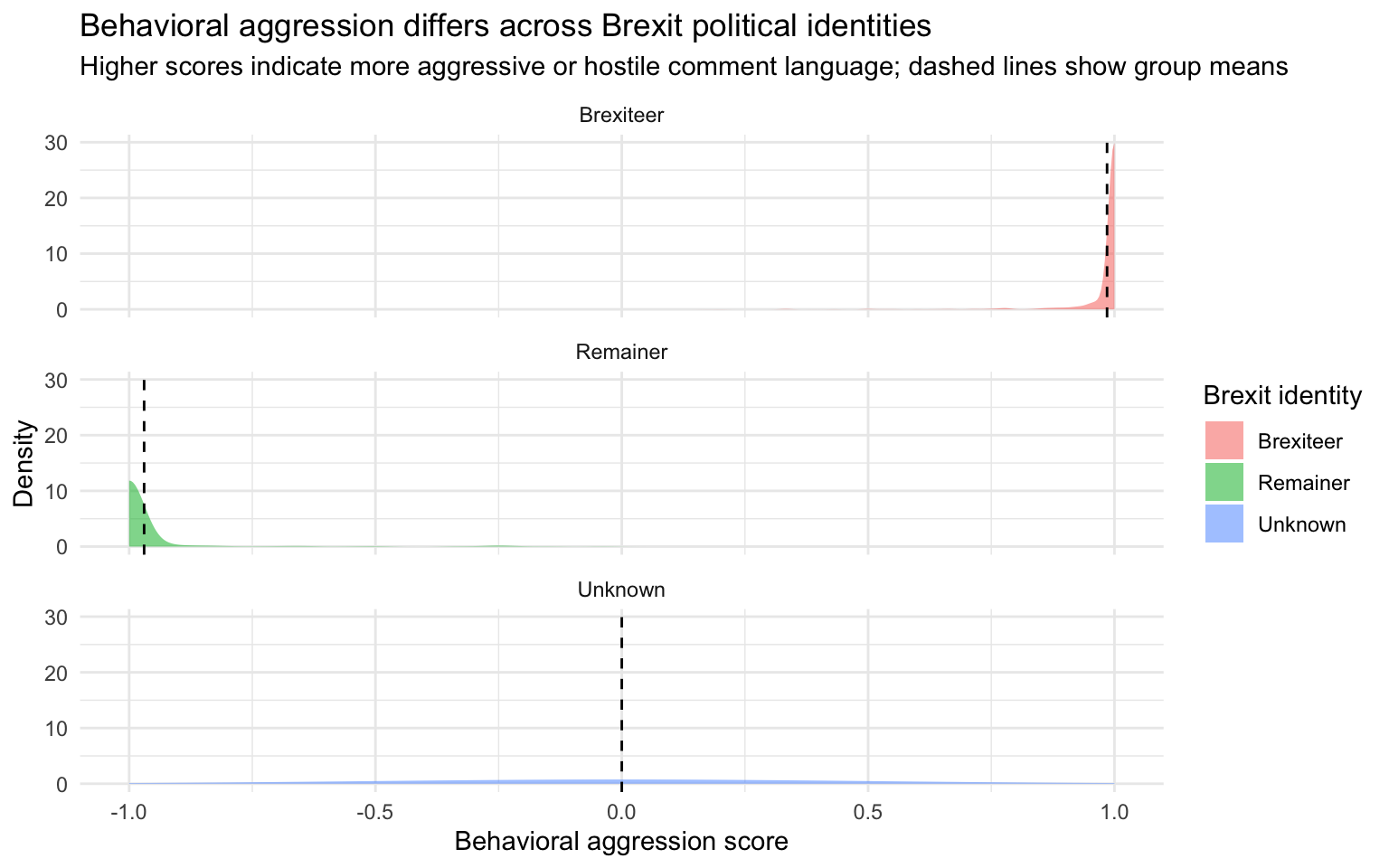
1097 3304 599 This visualization examines whether political identity is associated with differences in comment tone. Understanding this helps show whether discussions are polarized or balanced across groups.
Brexiteer Remainer Unknown
3613 781 606
Cross-cutting Like-minded Unknown
1097 3304 599 Behavioral aggression by Brexit Identity
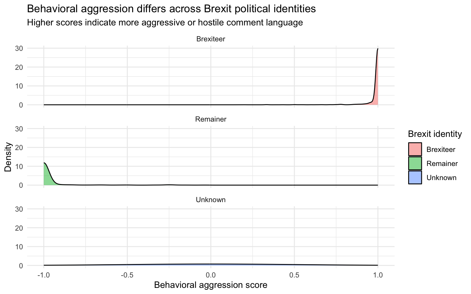
The draft visualization made comparison difficult because the distributions lacked clear visual guides such as reference lines to show group differences. It also did not highlight the main patterns or guide the reader toward the key takeaway. Additionally, the draft lacked visual emphasis on important features, making the overall story less clear and harder to interpret.
| Political Identity | Number of Comments | Mean Aggression Score | Median Aggression Score |
|---|---|---|---|
| Brexiteer | 3,613 | 0.99 | 1 |
| Remainer | 781 | -0.97 | -1 |
| Unknown | 606 | 0.00 | 0 |
The table shows strong polarization in comment tone across Brexit political identities. Brexiteer comments (3,613) have an average aggression score of 0.99 (median = 1), while Remainer comments (781) average –0.97 (median = –1), indicating clear separation between the two groups. The Unknown group (606 comments) centers at 0, suggesting neutral or unclear positioning. The close alignment between mean and median values suggests these patterns are consistent across comments rather than driven by a few extreme observations, providing evidence of systematic differences in tone by political identity.
The draft visualization made comparison difficult because all distributions overlapped in one panel. The lack of clear group separation made it difficult to compare differences across political identities. It also did not include reference markers such as means to guide interpretation.
It fixes several visual problems:
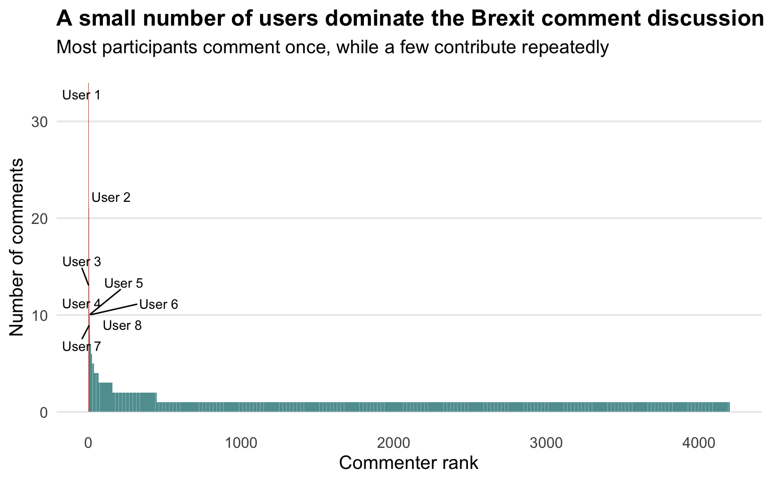
Highlights important information Instead of thousands of identical bars, it highlights the top commenters.
Makes the story clearer The title now tells the story: “A small number of users dominate the discussion.”
Labels extreme cases ggrepel prevents overlapping labels.
This visualization shows that participation in the Brexit discussion is highly concentrated. While thousands of users contributed at least one comment, most posted only once. A small minority of highly active participants contributed many more comments than the average user. I revised the draft visualization to highlight these extreme contributors while keeping the full distribution visible.