This visualization examines whether participation in Brexit comment discussions is broadly shared or dominated by a small number of highly active users. Participant IDs are anonymized and are **not shown** in the final graph.
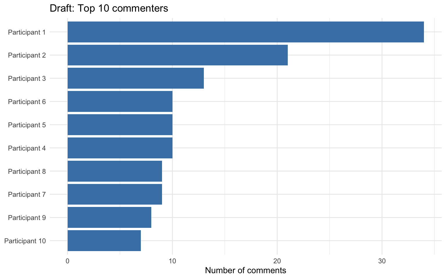
Version 1
What was missing in the draft
The draft only showed the ten most active users. While readable, it did not show the full participation pattern, so it was harder to support the claim that a small number of participants dominate the discussion.
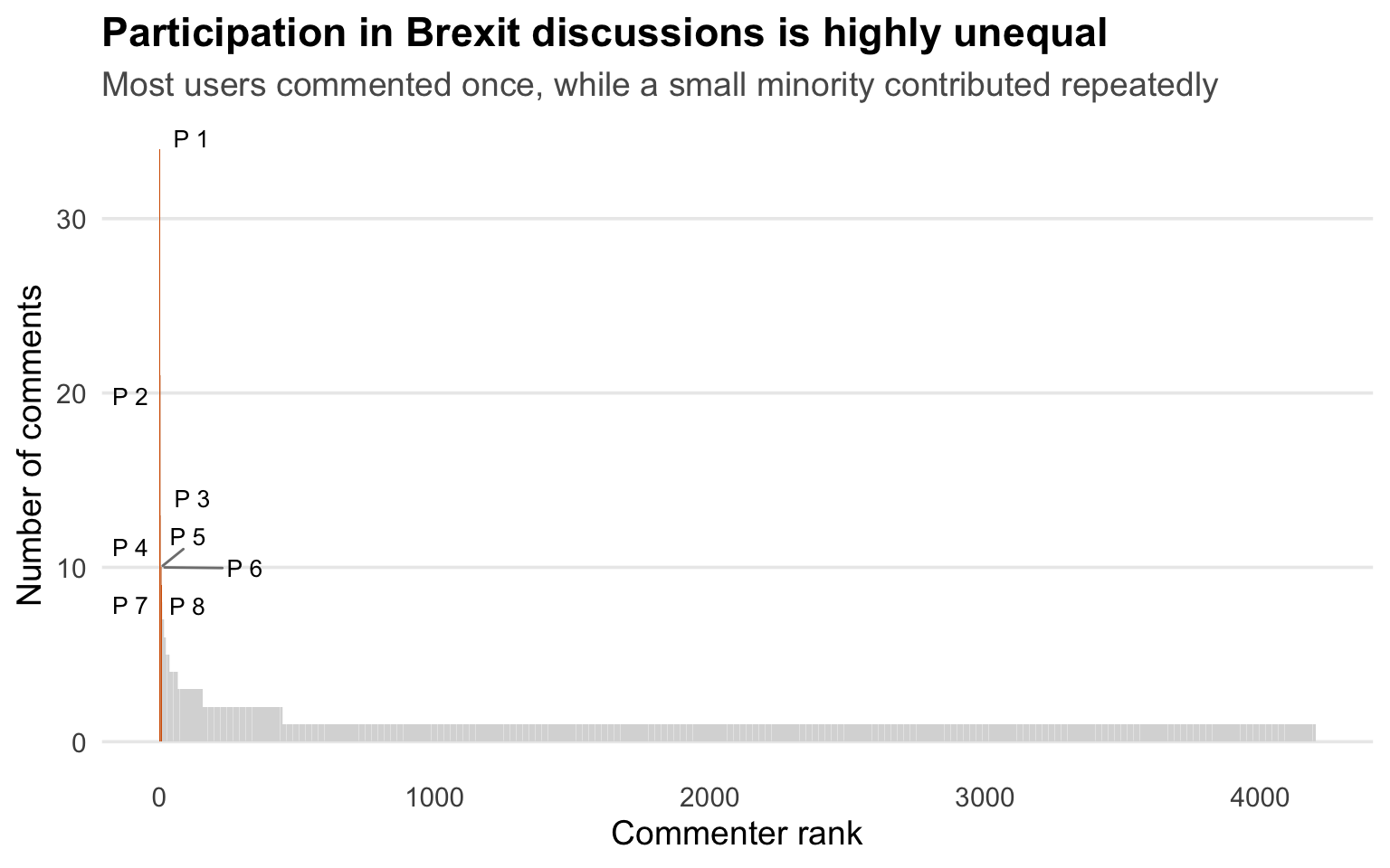
Version 2
What was missing in this draft
This shows that participation is highly concentrated: while many users appear in the discussion, a small minority account for repeated activity. I revised the original top-10 version to show the full ranked distribution so the inequality in participation is visible across the entire dataset.
Best Version
Why this version is better?
Using a lollipop chart instead of traditional bars reduces visual clutter and makes the distribution easier to read, clearly showing how a small number of highly active users contribute much more than the long tail of less active participants.
The use of red (Top 10), orange (Top 11–50), and grey (remaining users) applies color meaningfully to highlight differences in participation, helping viewers quickly identify the most important groups while keeping the focus on the most active contributors.
Adding interactivity allows viewers to hover over points to see exact ranks and comment counts, which is especially useful where many users appear compressed together visually.
The color choices differ in brightness and hue, making the visualization more accessible and easier to distinguish for viewers with common forms of color vision deficiencies.